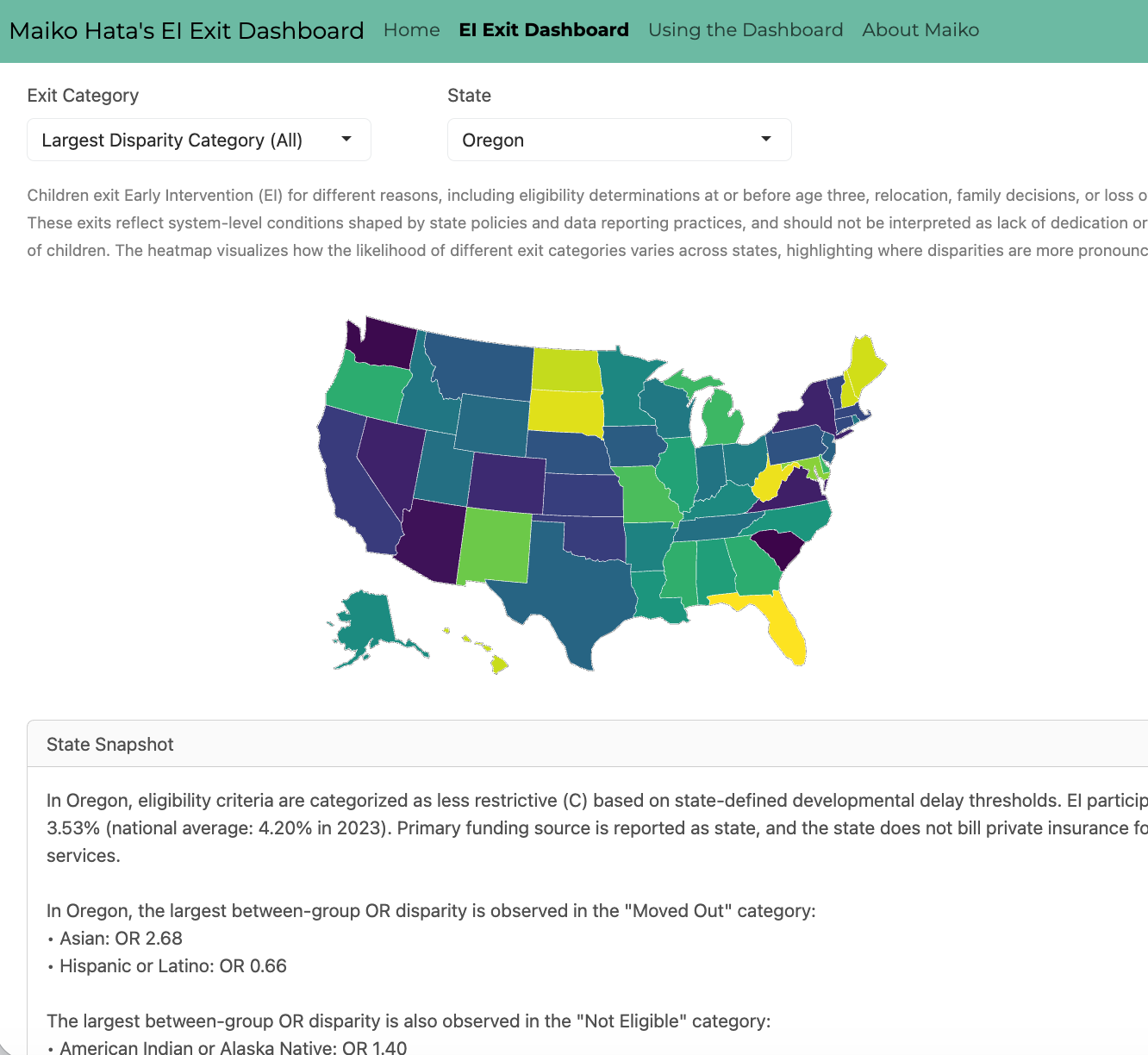
I created an interactive dashboard using Shiny and R to examine how infants and toddlers exit Early Intervention (EI) across U.S., with attention to equity and policy context. Drawing on publicly available OSEP Part C data, the dashboard visualizes exit categories such as Not Eligible, Dismissed for Lost Contact, Withdrawn, and Part B Eligible. Odds ratios and log-scaled heatmaps allow users to compare state patterns while reducing distortion from extreme values or small cell sizes.
The goal is not to rank states or evaluate families. I approached this work with care to avoid deficit-based interpretations. Exit patterns reflect differences in funding structures, service provision, and broader social determinants of health. These patterns are shaped by structural conditions and intersecting systems of race, language, disability, and access, including when and how children are identified and connected to EI , not by family commitment.
Suppressed or unreliable cells are clearly marked to reduce overinterpretation and encourage responsible use of the data. The dashboard is still evolving, but the core analyses and visualizations are in place.
The dashboard can be accessed here. For an updated CV, please click here.