This is the second part of my data visualization journey. For this, I used the same dataset as in the previous post, which showed racial representation in Early Intervention (EI) across the U.S. I compared that data to racial representation in Oregon, using information from the same OSEP website. I combined data from 2013 to 2022 to get the most statistical power for later analysis.
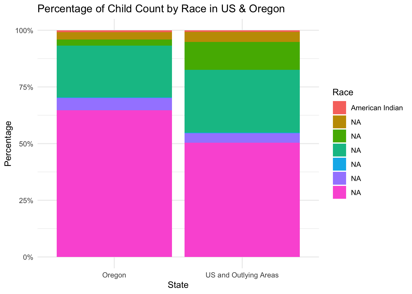
First, I created a bar chart using ggplot() with the geom_bar() function.
Code
ggplot(childcount1920USOR_long, aes(x = state, y = percent, fill = race)) +geom_bar(stat ="identity") +scale_y_continuous(labels = scales::percent_format(scale =1)) +scale_fill_discrete(labels =c("American Indian")) +labs(title ="Percentage of Child Count by Race in US & Oregon",x ="State",y ="Percentage",fill ="Race") +theme_minimal()
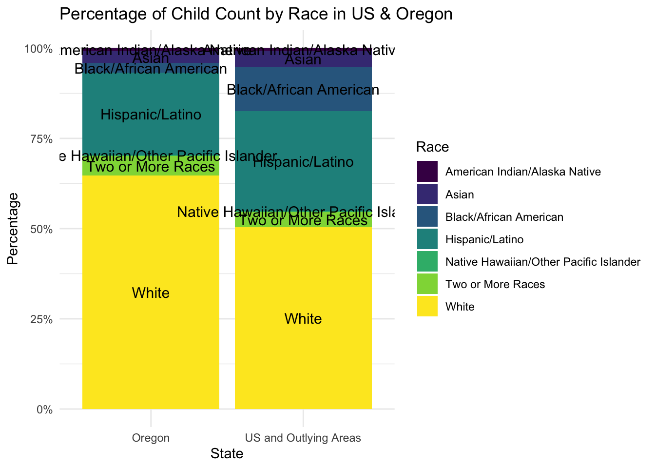
Here is an example of how labeling can be completely inappropriate. However, I appreciate using the viridis color palette with scale_fill_viridis_d(), as it helps make colors more accessible for people with color perception differences.
Code
ggplot(childcount1920USOR_long, aes(x = state, y = percent, fill = race)) +geom_bar(stat ="identity") +scale_fill_viridis_d() +scale_y_continuous(labels =percent_format(scale =1)) +labs(title ="Percentage of Child Count by Race in US & Oregon",x ="State",y ="Percentage",fill ="Race") +geom_text(aes(label = race), position =position_stack(vjust =0.5), color ="black", size =4) +theme_minimal()
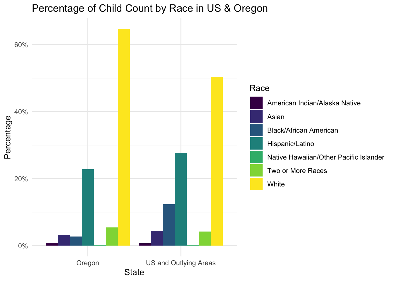
I really enjoy how easy it is to play with different types of plots that ggplot() offers.
Code
ggplot(childcount1920USOR_long, aes(x = state, y = percent, fill = race)) +geom_bar(stat ="identity", position ="dodge") +scale_fill_viridis_d() +scale_y_continuous(labels =percent_format(scale =1)) +labs(title ="Percentage of Child Count by Race in US & Oregon",x ="State",y ="Percentage",fill ="Race") +theme_minimal()
So, I kept experimenting.
Code
ggplot(childcount1920USOR_long, aes(x = race, y = percent, fill = state)) +geom_bar(stat ="identity", position =position_dodge(width =0.7)) +scale_fill_viridis_d() +scale_y_continuous(labels =percent_format(scale =1), expand =expansion(mult =c(0, 0.05))) +labs(title ="Percentage of Child Count by Race in US & Oregon",x ="Race",y ="Percentage",fill ="State") +geom_text(aes(label = scales::percent(percent /100, accuracy =0.1)), position =position_dodge(width =0.7), vjust =-0.5, color ="black", size =4) +theme_minimal(base_size =14) +theme(legend.position ="bottom")
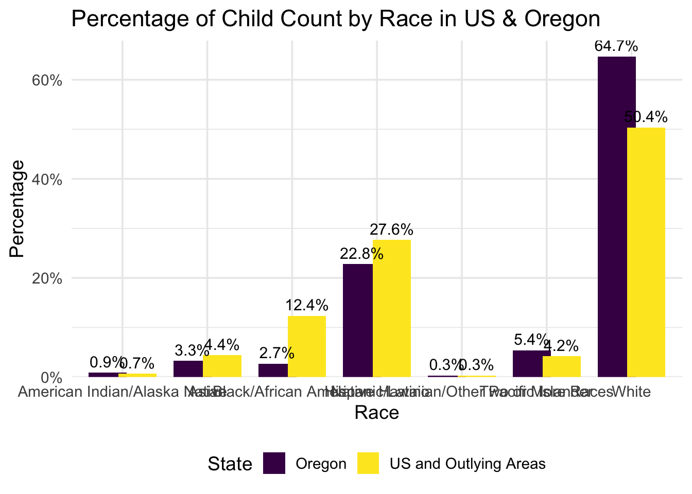
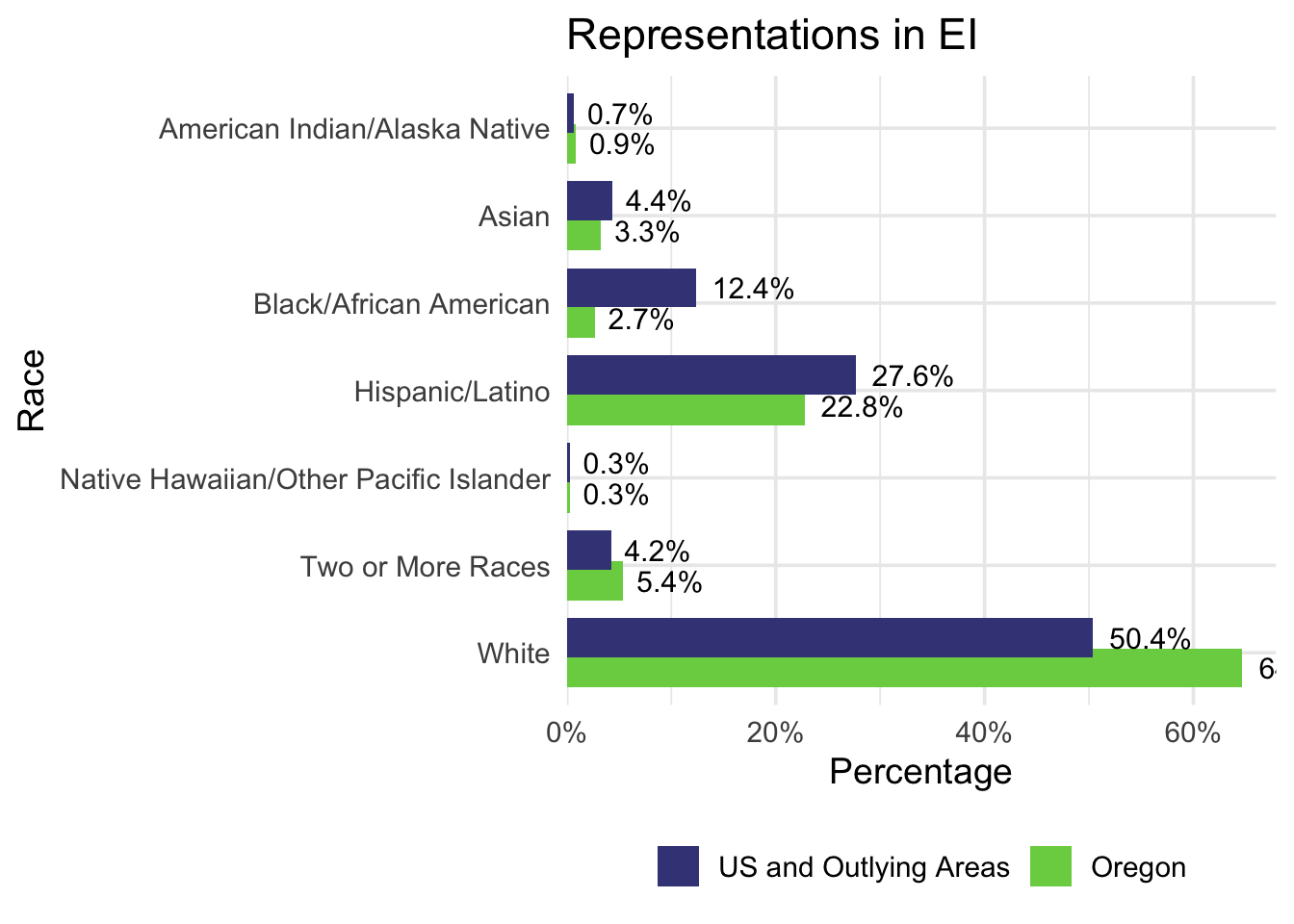
After making adjustments to show the data more clearly and accurately, here is the final version that shows the data best! Flipping the X and Y axes helps readers understand the categories more easily, and the data labels make it clearer to see the exact differences between the national data and Oregon’s data. I also assigned specific colors from the viridis color pallette for the national and Oregon’s data to maintain consistency in future visualizations.
Code
viridis_colors <-c("Oregon"="#7ad151", "US and Outlying Areas"="#414487")