Code
corrplot(chi_results$stdres,
         is.cor = FALSE,
         tl.cex = 0.7)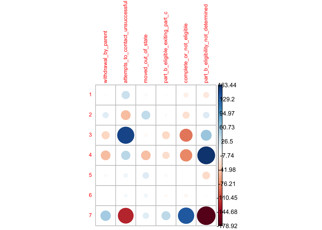
Here, I performed a chi-square test and used standardized residuals to interpret the results. I visualized the findings with corrplot(), one of my favorite packages. As I mentioned in my previous post, children exit Early Intervention (EI) services for various reasons. I wanted to examine whether there are disparities in how they exit based on their racial backgrounds.
Chi-square test determines if the distribution of a sample is different from what we would expect by chance (Agresti, 2013). It helps researchers understand whether the differences between observed and expected counts are likely due to random variation (Morgan et al., 2020). Standardized residuals shows how much the observed counts differ from the expected ones, considering the influence of independent variables on dependent variables (Chatterjee, 2011). This visualization helps us identify where the largest disparities exist between expected and actual exit patterns across race.
This is when I truly understood the power and flexibility of R, as it allowed me to present the story of the data through clear and intuitive visualizations.
Do you notice how group 2 is over-represented and group 7 is under-represented in Attempts to Contact Unsuccessful (“Dismissed”)? Also, group 7 is noticeably underrepresented in Part B Eligibility Not Determined (“Not Determined”), but the same group is over-represented in Complete or Not Eligible (“Not Eligible”).
Let’s see who these groups are.
Here is my first attempt. Even though it’s a bit messy, I was really impressed that I could run this analysis and create the visualization so easily.
corrplot(chi_results$stdres,
is.cor = FALSE,
tl.cex = 0.7)
Then, I renamed the columns and rows, and experimented with different plots.
corrplot(chi_results$stdres,
         method = 'square',
         is.cor = FALSE,
         tl.cex = 0.6)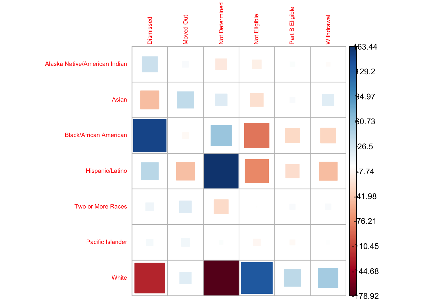
corrplot(chi_results$stdres,
         method = 'ellipse',
         is.cor = FALSE,
         tl.cex = 0.6)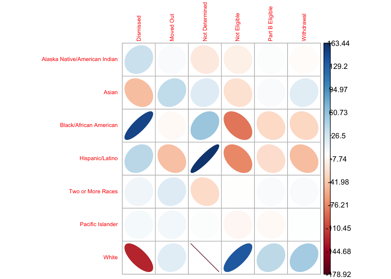
I finally settled on this version, where I:
Changed the letter color to black as the red was unnecessarily alarming
Moved the label numbers further out for easier reading
Reordered the exit categories alphabetically.
corrplot(chi_results$stdres,
         is.cor = FALSE,
         tl.cex = 0.8,
         tl.col = "black",
         cl.cex = 0.7,
         cl.offset = 1,
cl.ratio = 0.2) 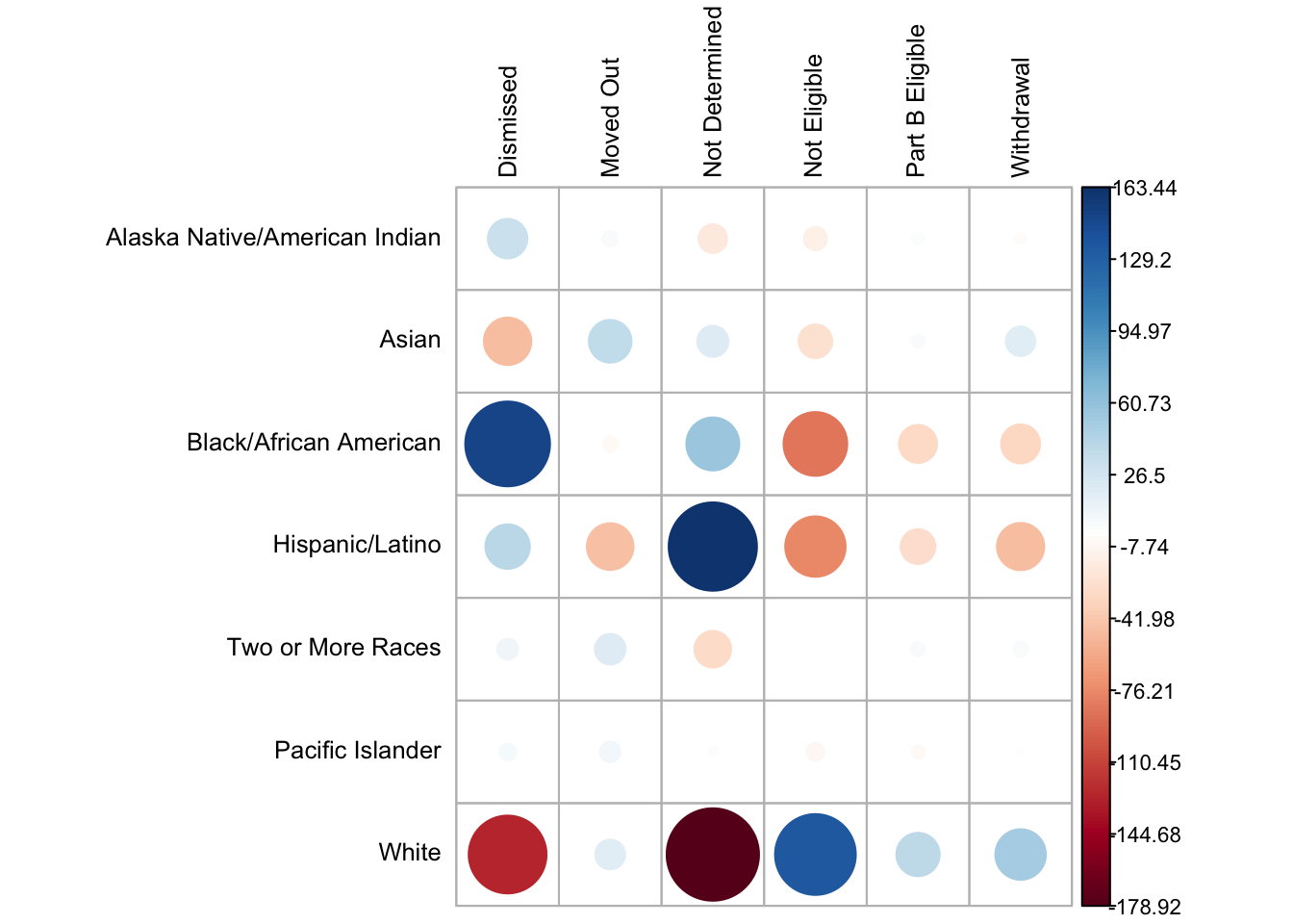
For my dissertation, I will analyze similar data broken down by home language status and Medicaid eligibility.